**A number of members of the MarcEdit community provided feedback while working on these changes. Specifically, Heidi Frank (NYU) and Jim Taylor (of http://jtdata.com) for contributing their time and some artistic skill in creating some of the new functional icons.
In addition to a handful of bug fixes and enhancements, one of the big changes coming to the next MarcEdit update will be around UI changes. I’ve been taking some time and collapsing menus to try and shorten them a bit (they are getting long) and refreshing a few of the screens and tools. The first screen to be refreshed and includes some significant enhancements is the start screen.
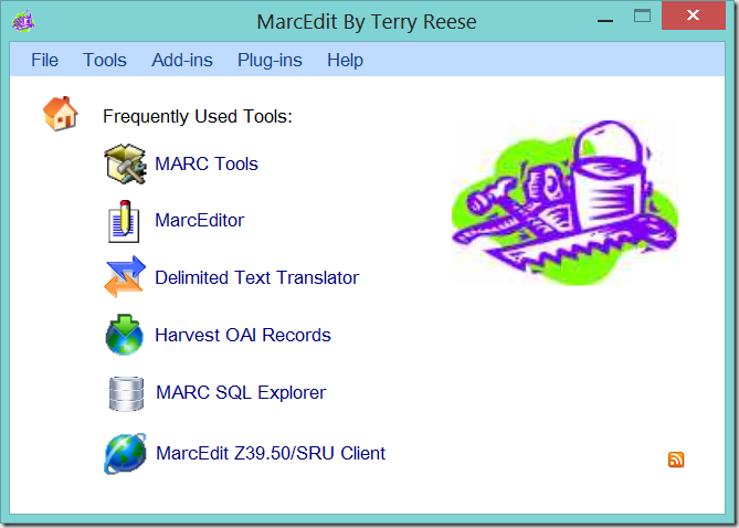
Current Start Screen
The MarcEdit start screen has been largely unchanged for close to 5 years. The start screen has included a start screen that includes access to a handful of tools and utilities that I have heard are fairly commonly used.
Over the years, I periodically change the tools and utilities available on the start page, but by and large, it has stayed largely static.
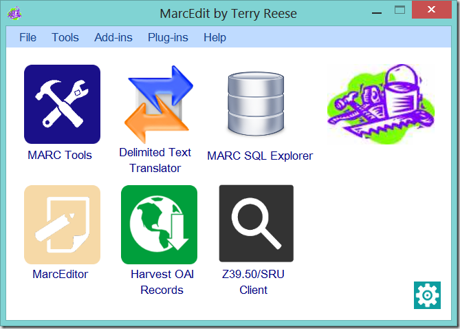
Updated Start Screen
The next update will reflect a shift in the start screen design. First, the page will move from a more textual/information screen, to one that is more reliant on both graphics and text to help users find the right tool. Secondly, the start screen will be customizable. The screen will provide the ability for users to define what tools that they want to have quick access too.
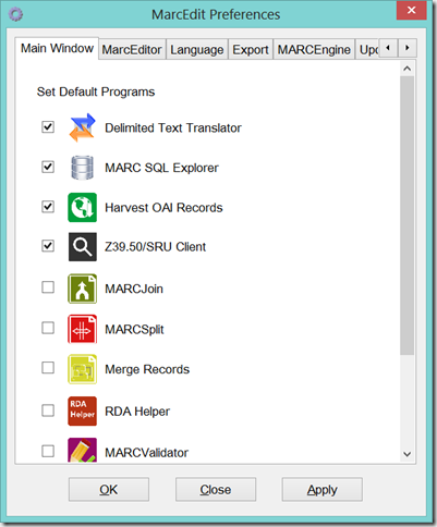
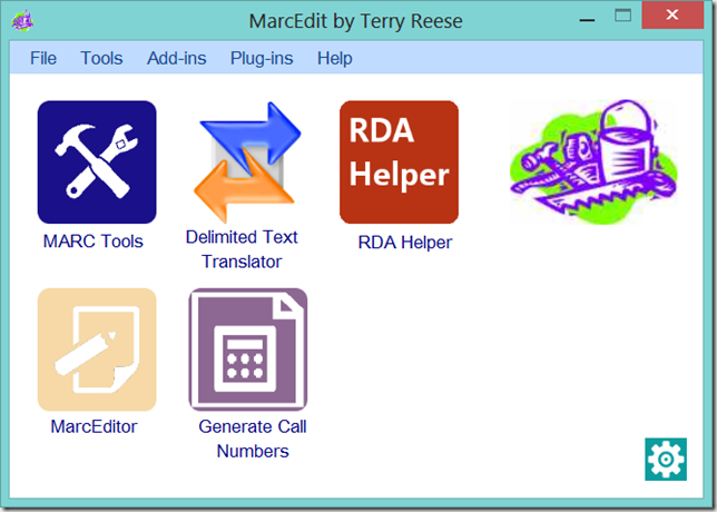
The Updated Start Screen will include larger images, with text — to help users quickly locate the tool that they are looking for on the start screen. However, unlink past versions, users can change the tools available from this screen. By clicking on the lower right hand configurations icon, or selecting Preferences from the Tools menu, users will be presented with the following new configuration option:
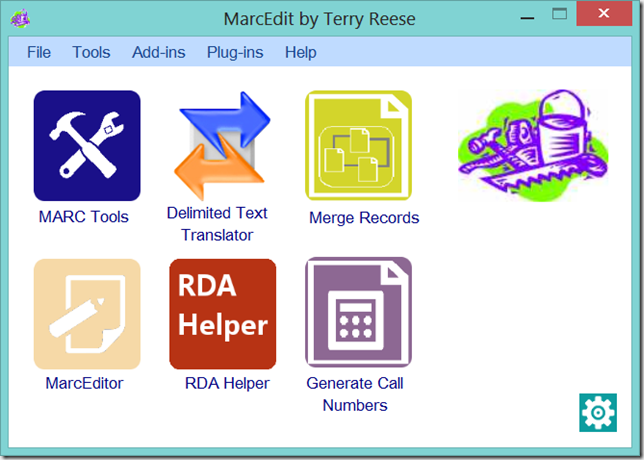
The next configuration options pull out the 12 most commonly used tools/add-ins. Users can select up to 4 of these items and place them on their start screen. By selecting new items, and clicking OK, the user will find that their application lay out changes:
Here, I changed the default options to selected the Delimited Text Translator, the Merge Records Tool, the RDA Helper, and the Call Number Generator. These will now be available to me on the front screen whenever I open MarcEdit. And since these configuration changes are linked to a user’s profile, multiple users, on the same computer, could have different Start Screens depending on how the utilize the program.
As noted above, you can select up to 4 user tools to display on the front page. But users have the option to select as few options as they want as well. In this example, I removed an option and only selected the most common 3 tools for the Start Screen.
Conclusion
These UI changes are the first of what will be a handful of changes that I’ll be making to the tool over the next couple of months as I refresh the interface, clean up some old code and look to improve some of the workflows in the application. I’ll be posting wireframes through the MarcEdit listserv when I’m planning major changes, so if you are interested in having a voice on upcoming changes, keep and eye open on the MarcEdit list.
–tr
